A cohesive brand and website for a MarTech startup
How Hey Design modernized Sparkfive’s visual identity and reimagined its entire website.


Clear value communication
The new website immediately communicates the problem, the solution, and the unique Sparkfive advantage. It feels focused, sharp, and relevant to lean marketing teams.
A modern, trustworthy brand identity
The new visual identity aligns with Sparkfive’s mission of delivering simplicity, clarity, and confidence to marketing teams. The brand finally looks like the product it represents.
A scalable system for future growth
Every visual asset and template can grow with the brand. Sparkfive now has a strong foundation for product marketing, content marketing, and brand consistency.

The story
Sparkfive is a Digital Asset Management platform built for lean marketing teams. They help eliminate content chaos and make it effortless for small to mid-size marketing teams to organize, find, and share assets.
However, back then, their website did not communicate that value clearly enough. It felt outdated, and did not reflect the bold, vibrant emotional identity of their brand.
After working with Hey Digital, our B2B SaaS Performance Marketing Agency, Sparkfive approached Hey Design with a work-in-progress site. The structure was there, but the execution was holding the brand back.
They needed a complete redesign that reflected clarity, confidence, and simplicity, while supporting their messaging, value propositions, and product story.
The challenge
The typography did not match the brand identity
The site used Raleway, a decorative, elegant typeface that looked good in theory but limited clarity and readability in practice. Headlines felt heavy and clunky rather than modern and inviting.
The color palette lacked contrast and energy
Sparkfive’s logo is full of energy and movement, but that spark was missing from the site. The palette leaned toward pastel and muted tones. Sections blended into each other. CTAs were inconsistent and lacked hierarchy. The brand did not feel as confident and empowering as it actually is.
Visual hierarchy and navigation lacked guidance
The WIP site had multiple competing CTAs at the top, unclear priority between demo vs free trial, and too little contrast to guide the user journey effectively. Users had to think more than they needed to.
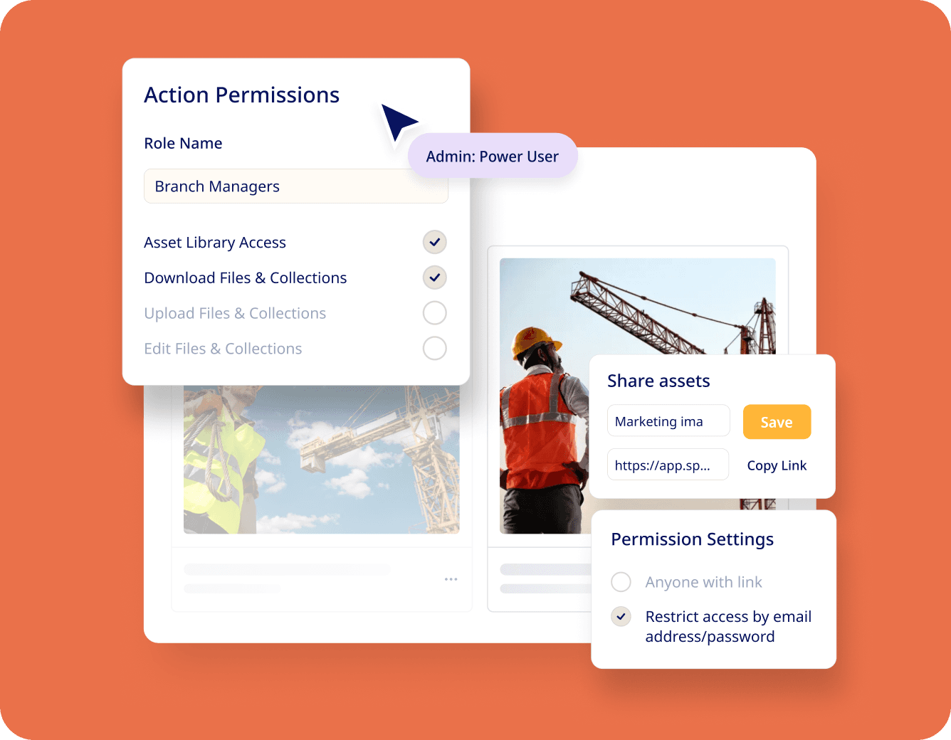
The site did not communicate Sparkfive’s product strength
Sparkfive is a modern DAM built for small teams. It is fast to set up, intuitive, and powerful where it matters. But the website did not bring those product moments to life visually. The brand deserved a visual identity that matched the ease and confidence of the actual product.
Our old site felt soft and inconsistent, and they turned it into something clear, confident, and modern. The new website finally reflects the product we’ve built. The process was smooth, collaborative, and genuinely fun.
Sparkfive

Our approach
Knowing that Sparkfive is trying to stand out in a crowded category, we asked two questions:
1. What does the brand want people to feel?
Empowered, clear, confident.
2. What does the product help users achieve?
End content chaos.
Work faster.
Find assets in seconds.
Share with control.
Scale without complexity.
Our redesign focused on aligning the visual identity with these emotions and outcomes.
The solution
A complete visual overhaul grounded in modern product design
We refined every major design element to match Sparkfive’s real identity.
New Typography System
We replaced Raleway with a clean, modern sans serif that delivers clarity and confidence. This made the product feel instantly more professional, more modern, and easier to read across device types.
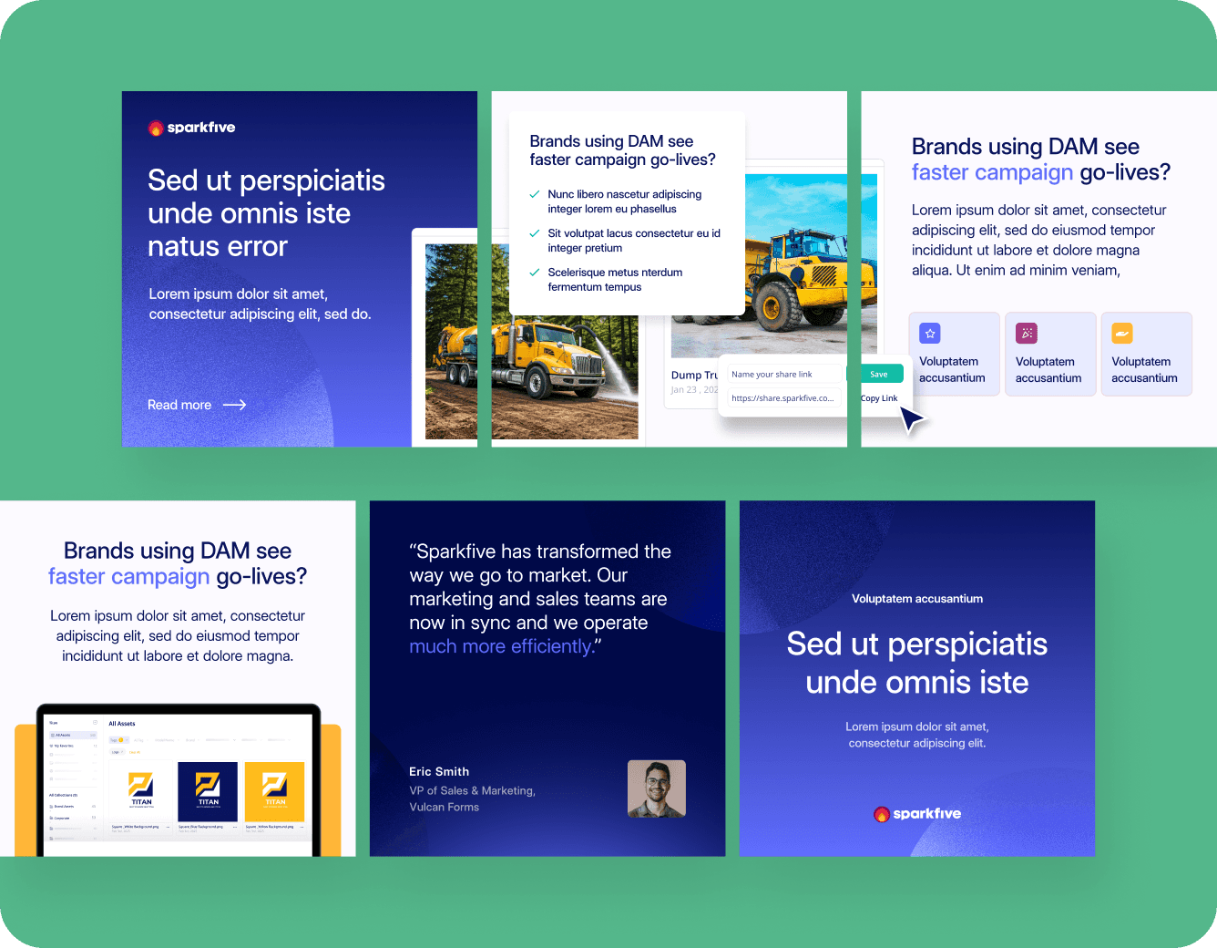
A more vibrant and memorable color palette
We leaned into Sparkfive’s core brand colors and used them with purpose.
The new palette creates energy, contrast, and memorability. Sections feel distinct. CTAs are clear and consistent. The site now feels bold without feeling heavy..
Clear CTA hierarchy
We helped Sparkfive define the single most important conversion action: Demo Bookings.
The new design makes it immediately obvious what action to take, while keeping the experience clean and supportive.

Redesign of the homepage and product experience
The homepage was rethought from the ground up.
We turned their product into the hero. We introduced strong layouts, better spacing, sharp iconography, and purposeful use of contrast.
We also designed supporting pages, including:
Solution pages
Product features
Use cases
Industry targeting
Comparison pages
Pricing and resources
This allowed Sparkfive to speak to buyers across the entire journey.
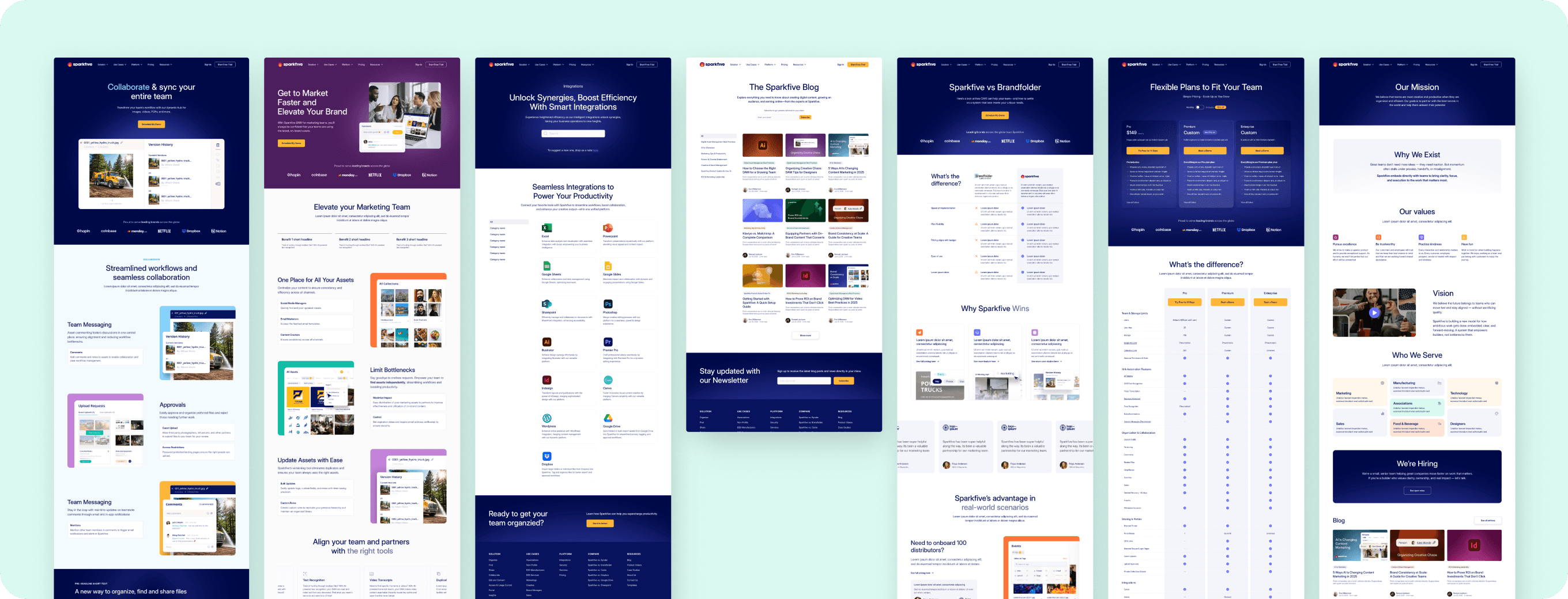

Beautiful product shots and UI mockups


A cohesive social media and email design system

Sparkfive now has a digital presence that matches their product quality, brand story, and value proposition.
Clear value communication
The new website immediately communicates the problem, the solution, and the unique Sparkfive advantage. It feels focused, sharp, and relevant to lean marketing teams.
A modern, trustworthy brand identity
The new visual identity aligns with Sparkfive’s mission of delivering simplicity, clarity, and confidence to marketing teams. The brand finally looks like the product it represents.
A scalable system for future growth
Every visual asset and template can grow with the brand. Sparkfive now has a strong foundation for product marketing, content marketing, and brand consistency.
In their words:
Sparkfive
Conclusion
After working with Hey Digital, our B2B SaaS Performance Marketing Agency, Sparkfive approached us with a WIP site and a strong product. They walked out with a brand identity, digital home, and content system that finally communicates who they are.
This project was a perfect example of what Hey Design does best.